Flutter Column, Row 정리
이번 시간에는 Column 위젯과 Row 위젯에 대해 정리.
이 두 위젯은 플러터 레이아웃의 기본 뼈대를 이루는 중요한 요소지만,
개념 자체는 간단하다. 그러니 이번엔 쓱 보고 감각적으로 이해해보자
Flutter Layout Cheat Sheet
아래 사이트는 레이아웃을 바로 확인할 수 있는 사이트
https://medium.com/flutter-community/flutter-layout-cheat-sheet-5363348d037e
Flutter Layout Cheat Sheet
Do you need simple layout samples for Flutter? I present you my set of Flutter layout code snippets. I will keep it short, sweet and simple…
medium.com
Column 위젯이란?
Column은 세로 방향(Vertical) 으로 위젯을 나열하는 레이아웃이다.
“Column takes up as much vertical space as possible.”
Columns 위젯은 세로축의 가능한 모든 길이를 갖고 가로축의 길이만 제한
import 'package:flutter/material.dart'; // 데스크탑, 앱 등에 고루 UI를 적용할 수 있게 해주는 구글이 제공해주는 패키

void main() => runApp(MyApp());

class MyApp extends StatelessWidget {
  @override
  Widget build(BuildContext context) {
    return MaterialApp(
      debugShowCheckedModeBanner: false,
      // 실질적으로 모든 앱을 감싸고 있다.
      title: 'Appbar', // 앱을 총칭하는 이름 -> 스마트 폰 앱에서 최근 사용한 앱 보여줄 때의 이름
      theme:
          ThemeData(primarySwatch: Colors.green // 특정색의 응용들을 기본 색상으로 지정해서 사용하겠
              ),
      home: MyPage(), // home은 앱이 실행될 때 가장먼저 보여주는 페이
    );
  }
}

class MyPage extends StatelessWidget {
  @override
  Widget build(BuildContext context) {
    return Scaffold(
      backgroundColor: Colors.blue,
      body: SafeArea(
        child: Center(
          child: Column(
            mainAxisAlignment: MainAxisAlignment.center, // 칼럼의 중앙에 위치
            children: [
              Container(
                width: 100,
                height : 100,
                color : Colors.green,
                child: Text('container 1'),
              ),
              Container(
                width: 100,
                height : 100,
                color : Colors.white,
                child: Text('container 2'),
              ),
              Container(
                width: 100,
                height : 100,
                color : Colors.red,
                child: Text('container 3'),
              ),

            ],
          ),
        ),

      ),
    );
  }
}

mainAxisSize : MainAxisSize.min 으로 코드를 변경
class MyPage extends StatelessWidget {
  @override
  Widget build(BuildContext context) {
    return Scaffold(
      backgroundColor: Colors.blue,
      body: SafeArea(
        child: Center(
          child: Column(
            //mainAxisAlignment: MainAxisAlignment.center, // 칼럼의 중앙에 위치
            mainAxisSize: MainAxisSize.min, // 칼럼이 전체 다 차지 안하도록 만들기
            children: [
              Container(
                width: 100,
                height : 100,
                color : Colors.green,
                child: Text('container 1'),
              ),
              Container(
                width: 100,
                height : 100,
                color : Colors.white,
                child: Text('container 2'),
              ),
              Container(
                width: 100,
                height : 100,
                color : Colors.red,
                child: Text('container 3'),
              ),

            ],
          ),
        ),

      ),
    );
  }
}
verticalDirection를 이용하여 아래부터 정렬되도록 만들어보기
class MyPage extends StatelessWidget {
  @override
  Widget build(BuildContext context) {
    return Scaffold(
      backgroundColor: Colors.blue,
      body: SafeArea(
        child: Column(
          //mainAxisAlignment: MainAxisAlignment.center, // 가운데 정렬
          //mainAxisSize: MainAxisSize.min, // 칼럼 사이즈 컨테이너 사이즈 만큼
          verticalDirection: VerticalDirection.up, // 아래부터 정렬
          children: [
            Container(
              width: 100,
              height: 100,
              color: Colors.green,
              child: Text('container 1'),
            ),
            Container(
              width: 100,
              height: 100,
              color: Colors.white,
              child: Text('container 2'),
            ),
            Container(
              width: 100,
              height: 100,
              color: Colors.red,
              child: Text('container 3'),
            ),
          ],
        ),
      ),
    );
  }
}
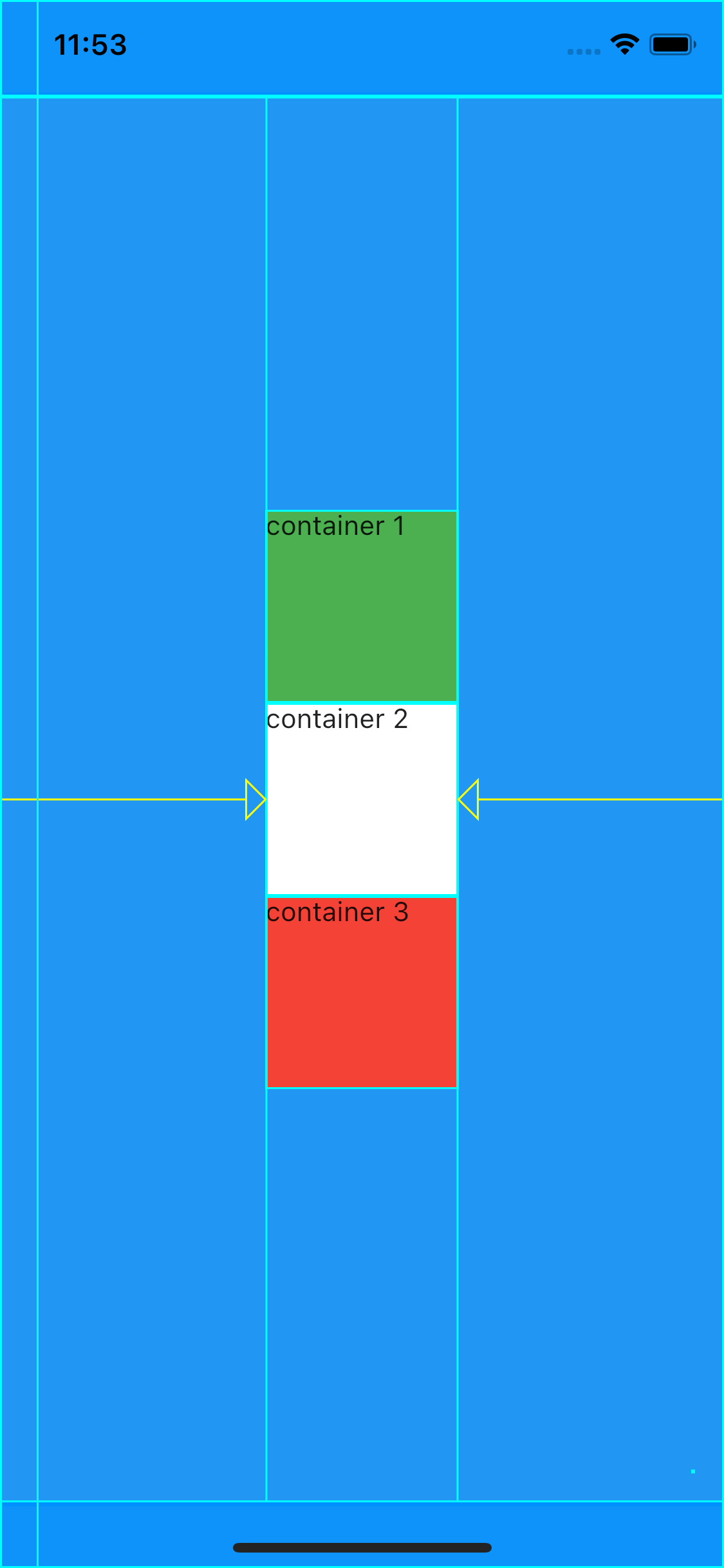
mainAxisAlignment
- MainAxisAlignment.spaceEvenly: 칼럼에서 같은 간격만큼 띄워서 (처음이랑 끝 공간도 포함)
- MainAxisAlignment.spaceBetween: 공간만 칼럼에서 나눠서 (처음이랑 끝 공간은 제외)
class MyPage extends StatelessWidget {
  @override
  Widget build(BuildContext context) {
    return Scaffold(
      backgroundColor: Colors.blue,
      body: SafeArea(
        child: Column(
          //mainAxisAlignment: MainAxisAlignment.center, // 가운데 정렬
          //mainAxisSize: MainAxisSize.min, // 칼럼 사이즈 컨테이너 사이즈 만큼
          //verticalDirection: VerticalDirection.up, // 아래부터 정렬
          //mainAxisAlignment : MainAxisAlignment.spaceEvenly, // 칼럼에서 같은 간격만큼 띄워서
          mainAxisAlignment: MainAxisAlignment.spaceBetween , // 공간만 칼럼에서 나눠서

          children: [
            Container(
              width: 100,
              height: 100,
              color: Colors.green,
              child: Text('container 1'),
            ),
            Container(
              width: 100,
              height: 100,
              color: Colors.white,
              child: Text('container 2'),
            ),
            Container(
              width: 100,
              height: 100,
              color: Colors.red,
              child: Text('container 3'),
            ),
          ],
        ),
      ),
    );
  }
}
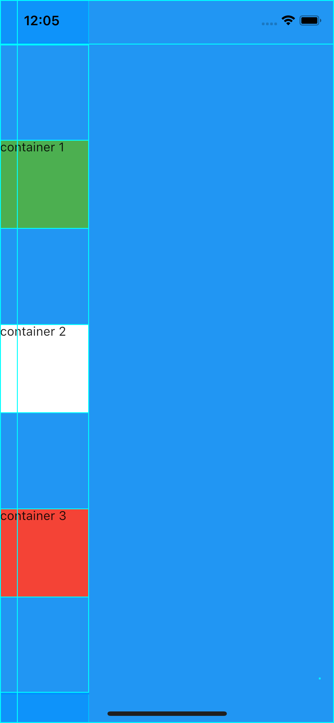

crossAxisAlignment
- CrossAxisAlignment.end : 컨테이너의 끝에 맞게 정렬
- 플러터에서는 width가 화면의 크기 밖으로 벗어나도 그 이상으로 커지지 않고 알아서 화면 끝 크기에 맞춤.
class MyPage extends StatelessWidget {
  @override
  Widget build(BuildContext context) {
    return Scaffold(
      backgroundColor: Colors.blue,
      body: SafeArea(
        child: Column(
          //mainAxisAlignment: MainAxisAlignment.center, // 가운데 정렬
          //mainAxisSize: MainAxisSize.min, // 칼럼 사이즈 컨테이너 사이즈 만큼
          //verticalDirection: VerticalDirection.up, // 아래부터 정렬
          //mainAxisAlignment : MainAxisAlignment.spaceEvenly, // 칼럼에서 같은 간격만큼 띄워서
          //mainAxisAlignment: MainAxisAlignment.spaceBetween , // 공간만 칼럼에서 나눠서
          //crossAxisAlignment: CrossAxisAlignment.end,
          children: [
            Container(
              width: 100,
              height: 100,
              color: Colors.green,
              child: Text('container 1'),
            ),
            Container(
              width: 100,
              height: 100,
              color: Colors.white,
              child: Text('container 2'),
            ),
            Container(
              width: 100,
              height: 100,
              color: Colors.red,
              child: Text('container 3'),
            ),
          ],
        ),
      ),
    );
  }
}
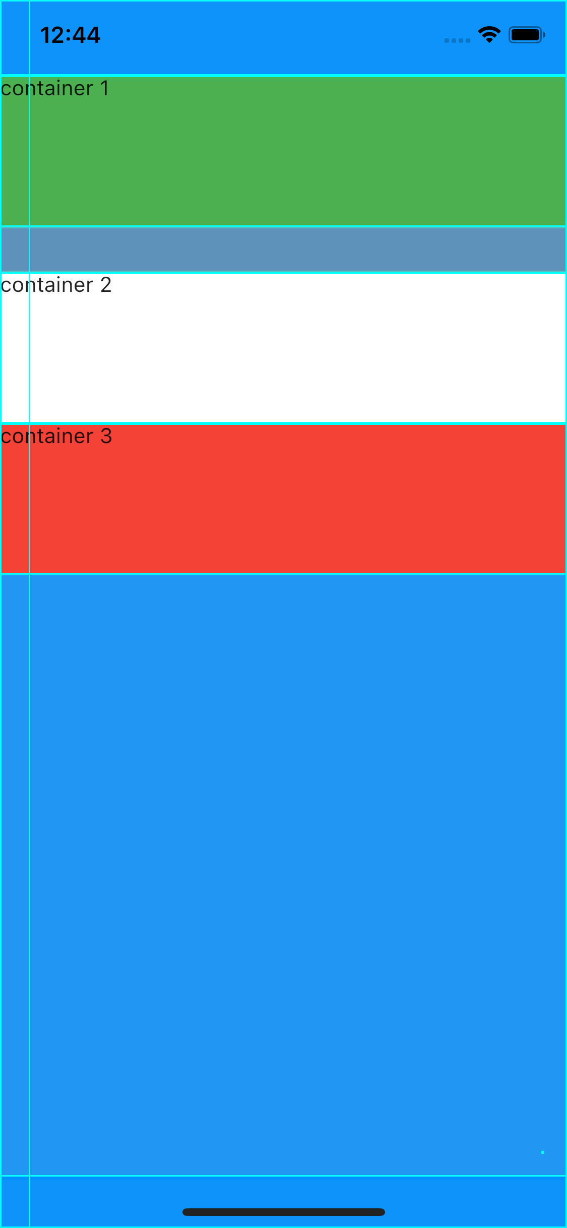
- CrossAxisAlignment.stretch : 화면의 가로축을 가능한한 최대로 늘림
- width는 무시되며, 적용되지 않음.
class MyPage extends StatelessWidget {
  @override
  Widget build(BuildContext context) {
    return Scaffold(
      backgroundColor: Colors.blue,
      body: SafeArea(
        child: Column(
          //mainAxisAlignment: MainAxisAlignment.center, // 가운데 정렬
          //mainAxisSize: MainAxisSize.min, // 칼럼 사이즈 컨테이너 사이즈 만큼
          //verticalDirection: VerticalDirection.up, // 아래부터 정렬
          //mainAxisAlignment : MainAxisAlignment.spaceEvenly, // 칼럼에서 같은 간격만큼 띄워서
          //mainAxisAlignment: MainAxisAlignment.spaceBetween , // 공간만 칼럼에서 나눠서
          //crossAxisAlignment: CrossAxisAlignment.end, // 칼럼의 끝에 맞춤
          crossAxisAlignment: CrossAxisAlignment.stretch, // 칼럼의 가로축을 최대로 - 대신 width 적용안돼
          children: [
            Container(
              width: 100,
              height: 100,
              color: Colors.green,
              child: Text('container 1'),
            ),
            Container(
              width: 100,
              height: 100,
              color: Colors.white,
              child: Text('container 2'),
            ),
            Container(
              width: 100,
              height: 100,
              color: Colors.red,
              child: Text('container 3'),
            ),

          ],
        ),
      ),
    );
  }
}

- invisible Container 활용
- invisible container 를 통하여 컨테이너를 끝까지 확장할 수 있음.
- 개념이 조금 생소해서 추상적으로 이해하면 더 쉽게 받아들일 수 있음.
class MyPage extends StatelessWidget {
  @override
  Widget build(BuildContext context) {
    return Scaffold(
      backgroundColor: Colors.blue,
      body: SafeArea(
        child: Column(
          //mainAxisAlignment: MainAxisAlignment.center, // 가운데 정렬
          //mainAxisSize: MainAxisSize.min, // 칼럼 사이즈 컨테이너 사이즈 만큼
          //verticalDirection: VerticalDirection.up, // 아래부터 정렬
          //mainAxisAlignment : MainAxisAlignment.spaceEvenly, // 칼럼에서 같은 간격만큼 띄워서
          //mainAxisAlignment: MainAxisAlignment.spaceBetween , // 공간만 칼럼에서 나눠서
          //crossAxisAlignment: CrossAxisAlignment.end,
          children: [
            Container(
              width: 100,
              height: 100,
              color: Colors.green,
              child: Text('container 1'),
            ),
            Container(
              width: 100,
              height: 100,
              color: Colors.white,
              child: Text('container 2'),
            ),
            Container(
              width: 100,
              height: 100,
              color: Colors.red,
              child: Text('container 3'),
            ),
            Container( // invisible Container
              width: double.infinity, // 갈 수 있는데까지 가로축으로 확장하라
              height: 20,
            )
          ],
        ),
      ),
    );
  }
}

- SizedBox 를 이용해서 간격 주기
- Row에서는 height -> width로 바꿈.
class MyPage extends StatelessWidget {
  @override
  Widget build(BuildContext context) {
    return Scaffold(
      backgroundColor: Colors.blue,
      body: SafeArea(
        child: Column(
          //mainAxisAlignment: MainAxisAlignment.center, // 가운데 정렬
          //mainAxisSize: MainAxisSize.min, // 칼럼 사이즈 컨테이너 사이즈 만큼
          //verticalDirection: VerticalDirection.up, // 아래부터 정렬
          //mainAxisAlignment : MainAxisAlignment.spaceEvenly, // 칼럼에서 같은 간격만큼 띄워서
          //mainAxisAlignment: MainAxisAlignment.spaceBetween , // 공간만 칼럼에서 나눠서
          //crossAxisAlignment: CrossAxisAlignment.end, // 칼럼의 끝에 맞춤
          crossAxisAlignment: CrossAxisAlignment.stretch, // 칼럼의 가로축을 최대로 - 대신 width 적용안돼
          children: [
            Container(
              width: 100,
              height: 100,
              color: Colors.green,
              child: Text('container 1'),
            ),
            SizedBox(
              height: 30,
            ),
            Container(
              width: 100,
              height: 100,
              color: Colors.white,
              child: Text('container 2'),
            ),
            Container(
              width: 100,
              height: 100,
              color: Colors.red,
              child: Text('container 3'),
            ),

          ],
        ),
      ),
    );
  }
}
Row는 Column 과 반대이므로 위의 설명을 보고 반대로 적용.
'Flutter > 2.0' 카테고리의 다른 글
| Flutter Navigator와 pushName 메소드 알아보기 (0) | 2021.08.16 |
|---|---|
| Flutter Navigator 간단 정리 (1) | 2021.08.16 |
| Flutter 컨테이너(Container) 정리 (0) | 2021.08.13 |
| Flutter에서 스낵바(SnackBar)와 토스트(Toast) 메시지 사용하기 (0) | 2021.08.13 |
| Flutter 2.0에서 버튼 위젯 변화 정리 (TextButton, ElevatedButton, OutlinedButton) (0) | 2021.08.13 |